{please ignore the wallpaper surrounding each photo...}

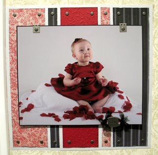
Isn't this an adorable portrait?? It definitely deserved its own page. If you life the big picture, you'll find two smaller 5x7 photos of different poses in the same dress. There are also places for her to journal inside...

I had a plan for this page and totally ditched it. Went with Plan B and am pleased with the results. Chris wasn't fond of that button border around the journal block, but I love it!! I think the mom will too...

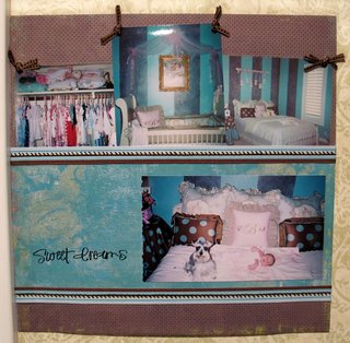
Her bedroom is teal and brown, and I just happened to have the perfect papers to match. Lucky me! This one isn't my favorite, but it showcases her room fine I think.
Let me know your thoughts!

3 comments:
OHH Kelley these are wonderful!!!!!! I absolutely love the first one, it fits the gorgeous picture perfectly!! Then I like the third one, then the middle one.
Your customer is going to be VERY pleased!
Love the one with the buttons ~ and then the first one but the colors on the second one a so pretty.
I like all three of them! Maybe buttons are a girl thing? I think they are perfect.
Post a Comment